
The Changing Face of Software
For most of computing history, people translated their intentions into forms, fields, menus, and commands. LLMs reverse that relationship, and change what an application needs to look like in the first place.

I remember learning to use Google; bringing words together in a shape I'd never use to speak to a human:
best sushi brooklyn open late
In 1995 this non-sentence would have been gibberish - yet by 2005 we had all learned how to do this. A pile of keywords arranged for a machine. The skill was in learning which words mattered, which ones got in the way, how to reformulate a reasonable question when the search box failed to understand it.
If you nailed it, you were "good with computers", and the world's information became available to you.
The same bargain runs through the rest of software, and we contort ourselves to hold up our end. A form asks us to split a name into two fields even when the name does not divide that way; a date field demands its preferred format and rejects three reasonable guesses; a dropdown contains every option except the one we need. To book a table, we take a request we could say in one breath ("can you get me in around seven next Tuesday?") and translate it into a date picker, a party-size selector, and whatever availability the system decided to expose. Resume portals and ATSes ask for a PDF and then for the same information to be keyed in again, field by field, and when one field fails validation the page quietly clears half of the others. We have all sat next to someone smart and capable who was hunched over one of these forms, apologizing to a screen, hunting for the button a designer somewhere swore was obvious.
The red error message says we failed; but isn't the software also failing to understand us? My autocomplete systems still can't fill in the 'State' field correctly across all address forms.
All of this was a huge upgrade over doing things with pen and paper, so there was cause for celebration at the time, and the decades have normalized this state of affairs. People develop skills to conform to the needs of machines. Using software means turning the fuzzy reality in our heads into the rigid representation a computer can accept: where the settings live, which sequence of screens completes a task, how a company divides its customers, invoices, and projects in its database. The interface exposes the data model; the person does the translation.
Intent before interface
Graphical interfaces made this translation far easier. In his 1983 paper on "direct manipulation," Ben Shneiderman described the appeal of operating on visible objects through rapid, incremental, reversible actions (1). Point at a file, move it, see the result. Recognition replaced recall, and computing opened to far more people.
But the graphical interface kept a deeper constraint: the product still had to decide, in advance, the valid things a user could say. Menus, buttons, fields, and screens formed a friendlier grammar, but they were a grammar. If your intent did not fit it, you adapted.
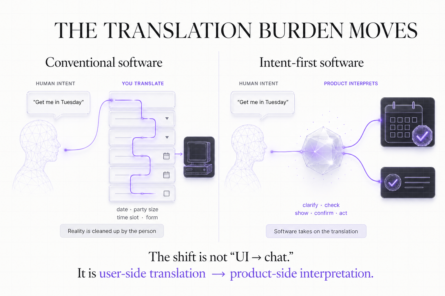
LLMs change the bargain because ambiguity no longer causes immediate failure. You can begin with an outcome before you know the right command, give an incomplete answer and get a useful follow-up question, correct yourself halfway through. The system can connect "send the revised one to Sarah" to a document and a person already in context rather than demanding two fully specified identifiers.
The first public description of ChatGPT emphasized exactly this behavior: follow-up questions, admitted mistakes, challenged premises (2). The interface looked almost aggressively simple, but the novelty was never the text box. The model took on more of the interpretation.
"Chat is the new UI" has dominated the last 18 months, but is too narrow a reading. Natural language is an input layer; conversation is only one possible output. Sometimes the right response is a sentence; sometimes it is a chart, a confirmation, a phone call, a generated report, or an action that happens quietly and leaves a receipt. The breakthrough is that software can understand intent before deciding which representation is useful.
A phone call in Dolores Park
I took a call sitting on the side of a hill in Dolores Park in San Francisco. For 25 minutes, I told Boardy where I was in building a startup, what I hoped the next step might be, and what I needed from meeting other people.

Once the call began, there was no screen to study, no empty dashboard waiting for me to populate it. I talked.
Boardy describes itself as an "AI Superconnector," an AI networking agent that facilitates professional introductions (3). That makes the call more than novel onboarding; conversation is the product's raw material. The useful input is the story: what I was trying to do, where I was stuck, and which kind of person could help.
A form could ask for all of that; I would only give it worse answers.
"What are your goals?"
"Who would you like to meet?"
"Describe your company."
Each question looks reasonable above a text box; together they put the work on me. I have to decide what matters before the product knows enough to help, compressing the messy version into startup shorthand and giving the answer I think the form expects.
This call worked differently. Boardy's Australian voice added some novelty, but the voice was not why it worked. It felt like talking to a practiced interviewer, someone who knew when to follow a lead, how to draw out the narrative, and when to ask a better second question. I could begin with a loose answer and talk my way toward what I meant.
It was the first time in my life I had a conversation with a computer that I enjoyed.
Afterward, Boardy messaged me on WhatsApp, and every few days it suggested someone in its network I might enjoy talking to. I never logged in, never installed an app; the experience was a phone call, messages, and introductions, the same forms a good human networker would use.
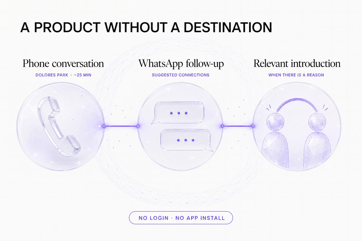
That absence of a traditional interface is a product decision. The standard instinct in software is to build a place: a web app, a mobile app, a home screen where the user can see the product exists. Sometimes that place is necessary; sometimes it is only another room the user has to remember to visit, another tab, another inbox.
The design question is not what an AI networking dashboard should look like, but how a good networker behaves.
Phone, WhatsApp, Slack, Telegram, and email can be more than acquisition or notification channels. For some products, they can be the user experience. They already carry social norms, identity, notification controls, and interaction patterns people understand. A product can arrive where the work is happening rather than demanding a new habit, destination, or login.
This does not make product design free. It moves the design work. How should the agent introduce itself, what should its vibe be? Which question produces an honest answer instead of a polished one? What should it remember? When is a follow-up welcome? When should it stop? A beautiful settings page cannot rescue a bad conversational experience. In a channel-native product, timing, judgment, tone, and restraint are interface design.
Screens become responses
The same shift applies to visual software.
A customer asks for another dashboard. They want pipeline by region, segmented by account tier, with monthly and quarterly views. Product scopes it, design adds it to reporting, engineering builds the query, permissions, chart, filters, export, loading state, and empty state. Six weeks later, another customer asks for almost the same report, except their regions differ and they care about product line.
This is how a product becomes a filing cabinet of screens.
For most of software history, product teams had to predict useful questions and encode the answers into permanent interfaces. Good teams found common patterns and made reusable workflows, configurable knobs and more branches to help 'personalize' the software. But reporting sections still accumulate frozen answers to questions someone once guessed users would ask.
Now the customer asks:
Which enterprise accounts are most likely to miss their onboarding date, and why?
The product can interpret "enterprise," "onboarding date," and "risk" using the organization's definitions; query only the records this user may access; and assemble a ranked table, a chart of delay factors, and a short explanation linked to the sources. That particular arrangement may only need to exist for this question and this moment.
This is no longer speculative as an interaction pattern. Google Research has begun shipping systems that generate interactive visual experiences for a prompt into Gemini and Search; its own evaluation found generated interfaces close behind human-designed ones and well ahead of plain text, with honest caveats about speed and accuracy (4). A separate 2025 study of generative interfaces found up to a 72% improvement in human preference over conversational interfaces across its tasks (5). The evidence supports a useful claim, not a maximal one: for information-dense or exploratory work, a generated interface can beat a long conversation. It does not prove that a model should improvise consequential controls.
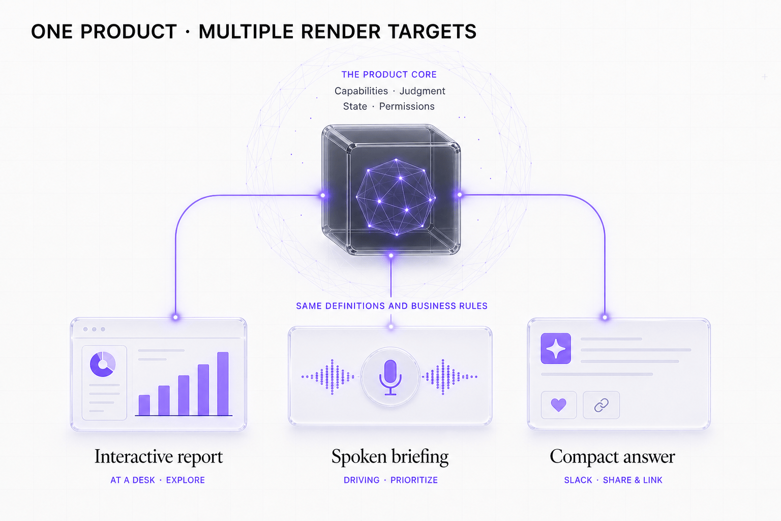
At a desk, that onboarding-risk question may become an interactive web report with filters and drill-down. In a car, it should become a short spoken briefing with the two accounts that need attention. In Slack, it may be one chart, three lines, and links to the underlying records.
The product, its state, and its permissions do not change; only the surface does.
This inverts a hidden assumption about where the product lives. If the interface can change by context, the product needs a stable layer underneath it: state, permissions, tools, evaluations, memory, and surfaces that can be composed without rebuilding the product each time. The interface can become fluid only when the product underneath it becomes more explicit. The dashboard is one render target among many, a single expression of what the product knows and can do; the product assembles an interface on top of those primitives for the task and the available attention.
This is more demanding than putting a copilot beside an existing app. Identity and permissions have to survive across surfaces: a Slack response must not reveal an account the user could not open on the web. A spoken summary needs a path back to inspectable detail; generated charts need source links and known definitions, not plausible shapes.
The surface still needs design: voice requires ruthless prioritization; shared channels require care with sensitive information; web reports need keyboard access, readable hierarchy, and reliable interactions. "Generate some HTML" is not a product strategy.
Research on adaptive interfaces offers an older warning worth keeping: in a controlled 2008 study, adaptation earned trust and use only when it was predictable and accurate (6). Users need a stable mental model of what may change.
Software learning a new sense
A slide deck editor is a good example of what this looks like when it is done properly. The old version is a canvas with menus, toolbars, and keyboard shortcuts. The naive AI version is a chat box that writes slide copy. The better version is a product where the agent can operate the same underlying deck model as the user. You select two objects and ask for alignment. You ask it to tighten the story. You switch into present mode and the available tools change.
Persona's WebMCP Slides demo, Deckmate, is a small working illustration of the pattern: a slide editor where a copilot edits alongside you, and every edit, whether made by the user or the copilot, goes through the same store, so undo works across both human and AI actions. Ctrl-Z does not care who made the mistake.
The important part is not that there is a chat panel. The important part is that both the human and the agent are acting on the same product state, with the same undo stack, permissions, and controls. That is what makes the interface feel less like a chatbot bolted onto software and more like software learning a new sense.
What should remain stable
Stable interfaces are excellent for frequent, predictable, or high-stakes work. Nobody wants payroll approval controls to reinvent themselves every Friday. An operator responding to an incident needs known controls, not a fresh composition that happens to look elegant. What used to be a semiannual UI redesign that resulted in momentary "hey, you moved my cheese!" reactions from customers could become a daily frustration if you're not careful.
Direct manipulation remains valuable for the same reasons it won in the first place: visibility, immediate feedback, incremental action, and reversibility. Generated interfaces should inherit those properties rather than discard them.
A useful rule:
- Generate the answer when the question is occasional, exploratory, or highly contextual. One-off research questions, curiosities, and cross-cutting "how does x connect to y", especially when trying to correlate disparate data sources without a perfect UI, are all good candidates.
- Stabilize the workflow when the task is frequent, predictable, consequential, or benefits from learned spatial memory. Bonus points for learning a user's preferences, way of working, and voice.
- Combine the two when language is the fastest way to express intent but a visual preview, edit step, or confirmation is the safest way to finish. Think about 'copilot' experiences which can use your UI faster than any human, or can do it via voice when they have french fries in one hand.
Moving a meeting is a simple example. "Find 30 minutes with Maya next week and avoid mornings" is a better starting point than navigating calendars. But before the software changes anyone's schedule, a stable confirmation showing the proposed slot, attendees, and conflicts beats a confident sentence claiming to have understood.
Intent first does not mean intent only. The product chooses an interface in service of the job rather than forcing the job through the interface it already has.
For builders, the first design question changes. Instead of starting from "what screens does this product need?", start from:
- What outcomes can the product reliably produce?
- What context must it understand, and what ambiguity must it resolve?
- What state, permissions, definitions, and approvals govern the work?
- Which surface fits the moment: conversation, a stable workflow, or a generated artifact?
- How can the user inspect, correct, undo, or confirm what happens?
For a long time, a power user was someone who had memorized enough of a machine's expectations to move quickly.
That is a backwards standard: software should become unusually good at understanding people, not the other way around. The interface is no longer where the product has to begin. Intent is.
The next generation of software will not be defined by whether it looks like chat or a dashboard. It will be defined by whether the product can understand intent, choose the right surface, operate safely on real state, and improve over time. The future belongs to products that pair generated, contextual interfaces with stable product infrastructure: state, permissions, tools, memory, evaluations, and surfaces. The screen is no longer the product. It is one rendering of the product.
References
- Ben Shneiderman. "Direct Manipulation: A Step Beyond Programming Languages." Computer 16, no. 8 (1983): 57–69. doi.org/10.1109/MC.1983.1654471
- OpenAI. "Introducing ChatGPT." November 30, 2022. openai.com/index/chatgpt
- Boardy. "Boardy — The AI Superconnector." Accessed July 2026. boardy.ai
- Google Research. "Generative UI: A rich, custom, visual interactive user experience for any prompt." research.google/blog/generative-ui
- Jiaqi Chen, Yanzhe Zhang, Yutong Zhang, Yijia Shao, and Diyi Yang. "Generative Interfaces for Language Models." arXiv:2508.19227, revised May 2026. arxiv.org/abs/2508.19227
- Krzysztof Z. Gajos, Katherine Everitt, Desney S. Tan, Mary Czerwinski, and Daniel S. Weld. "Predictability and Accuracy in Adaptive User Interfaces." CHI 2008. PDF